
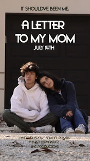
To add on to the little details we added, the font we used for most of the social media is supposed to mimic a typewriter letter font. Usually, the notes these people leave behind are handwritten. However, I felt like making it one of those journalistic fonts would have made it seem silly in a way, kind of like a middle school, coming of age comedy. The topic at hand is a very serious and important one, and I felt like the typewriter font just portrayed those elements as well as keeping the essence of a note. It also symbolizes production and pre-production. In the old Hollywood age, people wrote screen writes on typewriters and even now, scripts are in that font. This font contrasts the actual title font to not only make the title and posters pop out from the social media, but also to show the difference from the marketing to the actual movie. Staying on the subject of social media, the color I chose for most of the branding was also thought out. I chose blue to represent not only tears, but also subconsciously tell people how smart she is. This further characterizes the character as well as gives people a feel of what this movie could potentially make them feel. The posters and thumbnails also show simplistic pictures of the relationship between Liz and her best friend. With there being not much else going on in the poster, their relationship is visible and clearly understandable. I feel like the overall branding of the movie when it came to advertising was clear and concise when you think of all the elements that came to play in the making of the social media and posters. Even the trailers fit in with the other components and further create the brand by giving the social media a satisfying "end." The only thing I wish I'd done was collaborate with other "movies" on social media which has proven to gain followers with other projects.
The products we made engage with our audiences in a number of ways. The trailers were made with our target audience in mind. In this day and age, Generation Z spend a lot of time on their phone, especially on Tik Tok and Instagram. Spending too much time on these apps leads to short attention spans, and if something isn't connecting to them or not moving fast enough, they will scroll right there and then. Both trailers were meant to be fast paced while also touching the emotion that would connect with anyone who could sympathize with Liz's situation. With the social media, the consistent colors when you look at the Instagram page as a whole, are meant to be pleasing to the average human eye. Subconsciously, these types of pages are the ones who make people stay and make people follow the page. The captions and content on the social media are meant to connect with the language of my generation. The use of emojis and of short captions aren't meant for the audiences of older generations who prefer paragraphs with correct grammar. This goes back to attention spans being and people not being engaged if something isn't "nice and shiny" or short. I also made sure people knew what was going on at all times. I specifically made a post where it answered questions potential followers might have about what the film is and where it may be found.


.jpeg)
No comments:
Post a Comment